Work
About
Contact
Resumé
Work
About
Contact
Resumé
Parrot Bay Rum
St. Joseph's Health: The Faces of Breast Cancer
Tic Tac Gum: TV Spots & More!
Tic Tac: Frosty Mint Flavor Launch
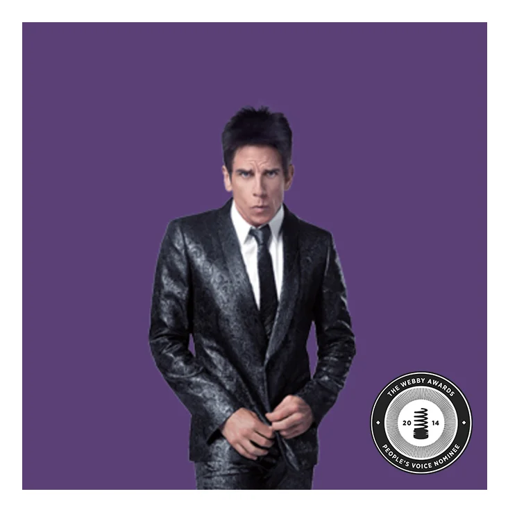
Kiehl's: The Derek Zoolander Center For People Who Don't Age Good
Kiehl's: Men's Grooming Line Launch
Kiehl's: Artfully Made
Schweid & Sons: The Very Best Burger
Taste Budz: Package Design & Concept
Private Parts Zine
T-Shirt Designs
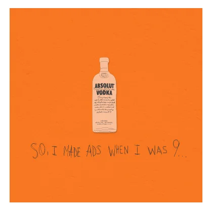
Absolut Vodka
Parrot Bay Rum
— view —
St. Joseph's Health: The Faces of Breast Cancer
— view —
Tic Tac Gum: TV Spots & More!
— view —
Tic Tac: Frosty Mint Flavor Launch
— view —
Kiehl's: The Derek Zoolander Center For People Who Don't Age Good
— view —
Kiehl's: Men's Grooming Line Launch
— view —
Kiehl's: Artfully Made
— view —
Schweid & Sons: The Very Best Burger
— view —
Taste Budz: Package Design & Concept
— view —
Private Parts Zine
— view —
T-Shirt Designs
— view —
Absolut Vodka
— view —